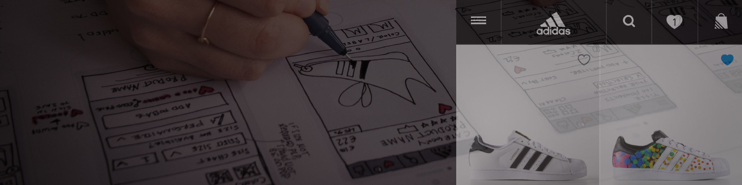
MY ROLE: LEAD UX DESIGNER & RESEARCHER
PROBLEM

60% of all first time orders use vouchers. 6% of all customer service calls revolve around issues with voucher codes. There are different types of promotions — product level discount, order level discount, free delivery, and free personalization. There is unclear communication on if and how promotions are applied to the users order / shopping bag.
INSIGHTS
Prior to kicking off design, the current voucher code communications in the checkout was tested in hopes to clarify why 6% of all customer service calls revolve around voucher codes. Another objective was to understand what can be optimized to the voucher code journey to make this experience more clear.
Key findings:
- 1. Product Exclusions: It is unclear when and which products are excluded from discounts. The communication on the product description page is missed by all participants.
- 2. Applied Codes: It is unclear on the bag where the voucher codes are applied and why there are exclusions.
- 3. Entering Codes: It is hard for participants to enter their 12-16 digit codes with hyphens and no supportive text about case sensitivity.
- 4. Code Entry Not Available: Entering a voucher code on the delivery page is not available. This is an issue when participants click on the "Checkout" button on the product description page overlay and land on a delivery page with no opportunity to enter a code.
- 5. Error Messages: Voucher error messages are unclear and not specific for all scenarios including — entering an incorrect code, or code has expired.

PROCESS
STEP 1: USER FLOW
First step was to document the voucher communication touch points along the user journey

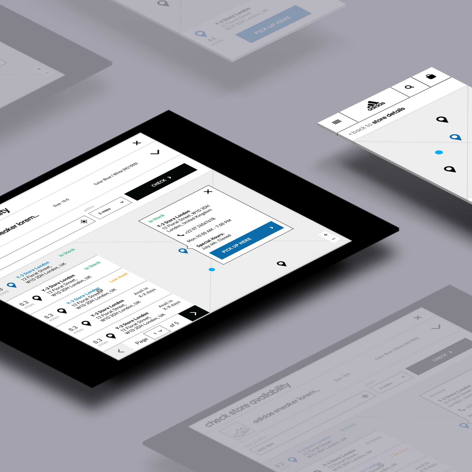
STEP 2: WIREFRAMES
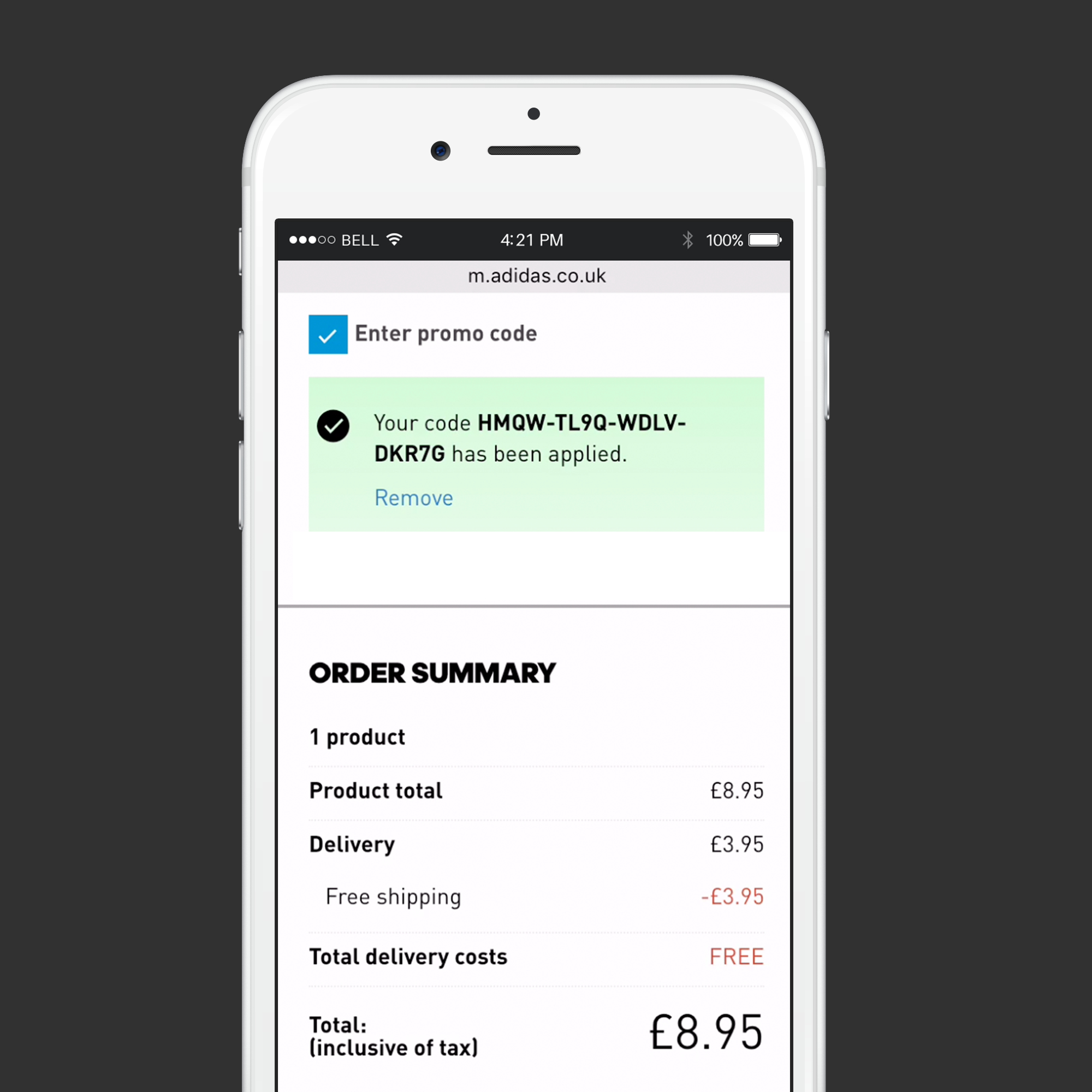
From the initial user test, the main issues were around the lack of clarity surrounding what products the voucher code applied to and what discount was received. Therefore, it was a priority to focus on optimizing the voucher code entry box and the order summary box.
PROMO BOX WIREFRAMES

ORDER SUMMARY BOX WIREFRAMES

RESULTS
After the update to the adidas promo code box and order summary box below, another user test was conducted to compare this update to the Reebok website which was not updated yet. Here are some quotes from the participants:
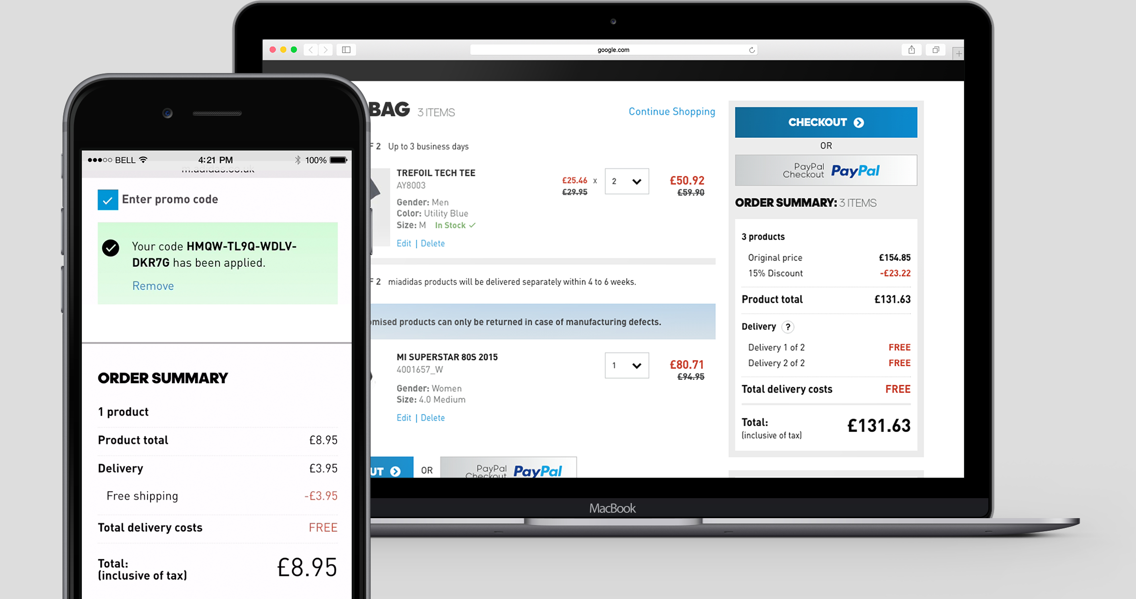
Live screenshots
"I personally prefer this one to the Reebok one because it clearly shows that there is a delivery cost of 3.95, and that you get this off...It actually fully acknowledges and calculates this. It is easier to work through later when reviewing"
— 23 | Male | United Kingdom | Mobile
"adidas put everything in line items which is so much better. The breakdown is far more detailed. It really shows me what I am saving and what benefit I have from using the code. Reebok does not have enough detail in the order summary."
— 35 | Female | United Kingdom | Mobile
“The order summary is more effective in showing the discount information...On the adidas site it even shows you the savings you make in the delivery section...It is clear and decisive”
VIEW MORE PROJECTS